
Maria tried to cancel a streaming subscription last week and found the cancel button buried three menus deep, followed by a full-screen offer for half off, then a survey asking why she wanted to leave, then a final confirmation asking if she was “really sure.” Signing up had taken her forty seconds. Canceling took nearly ten minutes and three separate attempts to talk her out of it. Nothing about that experience was an accident, every extra click was designed by someone, tested against real users, and kept because it worked.
What a Dark Pattern Is
A dark pattern is a design choice in an app or website deliberately built to steer users toward a decision that benefits the company rather than the user, often by exploiting how people naturally read, scan, and make quick decisions under mild pressure. The term covers a wide range of specific tactics, from a pre-checked box that adds an unwanted item to a cart, to a countdown timer implying a deal will vanish when it won’t. What ties them together is intent: these are deliberate design decisions, tested and refined, not accidental byproducts of clumsy interface design.
The Most Common Categories of Dark Patterns
Researchers who study interface design have grouped dark patterns into several recurring categories that show up across countless apps and websites.
- Confirmshaming, where declining an offer is phrased to make the user feel guilty or foolish
- Forced continuity, where a free trial silently converts to a paid subscription without a clear reminder
- Roach motel design, where signing up is effortless but canceling requires navigating a deliberately confusing path
- Hidden costs, where fees appear only at the final step of checkout after a user has already invested time in the process
- Bait and switch, where clicking an expected action triggers an unexpected, unwanted result instead
Recognizing these categories by name makes them easier to spot in the moment, since a labeled pattern is harder to fall for than a vague, unnamed sense that something about a checkout flow feels slightly off.
Why These Tactics Work So Reliably
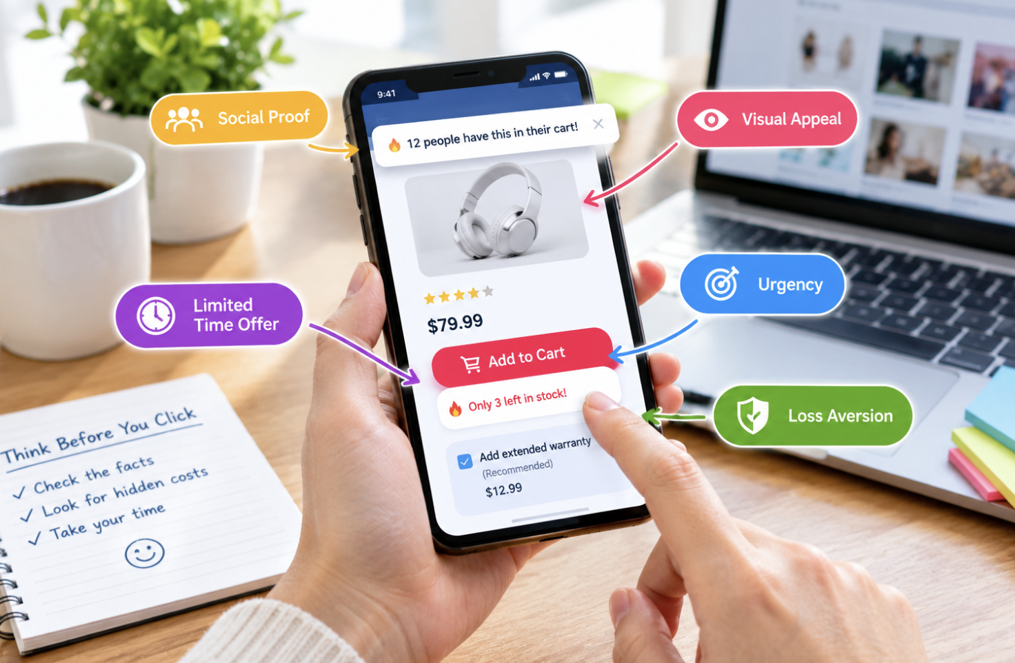
Dark patterns succeed because they target well-documented weaknesses in how people process information quickly, especially under mild time pressure or amid a cluttered interface competing for attention.
- Decision fatigue makes people more likely to accept a default option rather than actively opt out of it
- Loss aversion makes an artificial countdown timer or “only 2 left” message feel more urgent than it deserves
- Social proof notifications, like “14 people are viewing this,” exploit a natural tendency to follow perceived crowd behavior
- Visual hierarchy tricks, like a bright “accept” button next to a faint gray “decline” link, guide the eye toward the intended choice
None of this requires deceiving a user about facts directly, it works by shaping the environment around a decision so the path of least resistance happens to align with what benefits the company, which is precisely why dark patterns can be effective even against people who consider themselves generally savvy about manipulation tactics.
How Regulators Have Started Responding
Dark patterns have moved from a design ethics discussion into an active regulatory concern in several jurisdictions, with growing legal consequences for companies that rely on them too aggressively.
- Some consumer protection agencies have issued specific guidance defining and prohibiting certain dark pattern categories
- Legal cases have resulted in fines against companies for subscription cancellation flows deemed deliberately obstructive
- Newer privacy regulations increasingly include specific language addressing consent interfaces designed to confuse rather than inform
- Enforcement remains inconsistent across regions, meaning the same company’s interface might be legal in one jurisdiction and prohibited in another
This regulatory attention has already pushed some companies to simplify cancellation flows proactively, anticipating legal risk rather than waiting for an enforcement action, though the pace of this change varies enormously across industries and company sizes.
Distinguishing Dark Patterns From Legitimate Persuasion
Not every attempt to influence a decision counts as a dark pattern, and drawing this line matters for evaluating a specific design choice fairly rather than treating all persuasive design as inherently manipulative.
- Legitimate persuasion presents accurate information clearly and lets a user decide without obstruction
- A dark pattern typically relies on confusion, concealment, or an artificial obstacle rather than honest information
- A limited-time discount that’s limited is persuasion; a countdown timer that resets every visit is a dark pattern
- The presence of friction alone doesn’t indicate a dark pattern, the question is whether that friction serves the user or only the company
This distinction is useful for designers themselves, many of whom want to build persuasive, effective interfaces without crossing into territory that damages user trust and increasingly carries legal risk.
Practical Ways to Protect Yourself When Browsing and Shopping
While the responsibility for dark patterns sits with the companies deploying them, a few habits reduce how often you fall for them.
- Reading a checkout page fully before clicking any button, rather than scanning quickly and clicking the most prominent one
- Searching a company’s cancellation policy before signing up for any free trial, not after deciding to cancel
- Treating urgency messaging with skepticism, especially countdown timers that reappear on a later visit
- Using browser extensions or account settings that surface hidden subscription charges before they become a surprise
Building this habit of slowing down at exactly the moments an interface wants you to move quickly is one of the more reliable ways to avoid the specific friction dark patterns are designed to exploit.
How Designers and Companies Are Pushing Back Internally
A growing number of designers and product teams have begun pushing back against dark pattern use within their own organizations, framing the issue as a long-term trust problem rather than a short-term conversion win.
- Design ethics guidelines have become more common within larger technology companies’ internal practices
- Some organizations track long-term customer trust metrics specifically to counterbalance short-term conversion pressure
- Professional design communities have increasingly treated dark pattern techniques as reputational risks worth avoiding
- User research increasingly measures frustration and distrust alongside simple conversion rate improvements
This internal pushback doesn’t eliminate the practice industry-wide, but it does suggest the profession is becoming more self-critical about tactics that were, for a period, treated as simply clever design rather than something worth scrutinizing more carefully.
How Mobile Apps Have Adapted These Tactics for Smaller Screens
Mobile interfaces present a distinct set of challenges and opportunities for dark pattern design, since limited screen space forces choices about what information gets shown clearly and what gets pushed off-screen or hidden behind an extra tap.
- Small screens make it easier to hide a decline option below the visible fold while keeping an accept button prominent
- Push notification permission requests are sometimes timed to appear during a moment of high engagement, increasing acceptance rates
- In-app purchase flows for games often use bright, animated visuals for spending prompts while payment confirmation screens use plain, easy-to-miss text
- Swipe gestures can be designed so an accidental swipe triggers a purchase or subscription action rather than a neutral result
Mobile-specific regulation has lagged behind desktop-focused consumer protection rules in several regions, leaving app-based dark patterns somewhat less scrutinized than their website equivalents, even though the underlying tactics and their effects on users are largely the same.
The Long-Term Business Cost of Relying on These Tactics
Companies that lean heavily on dark patterns often see short-term metrics improve while damaging something harder to measure immediately: customer trust and long-term retention.
- Customers who feel tricked into a subscription are more likely to leave negative reviews and warn others away from a service
- Word-of-mouth damage from a bad cancellation experience can outweigh the revenue gained from delaying that single cancellation
- Regulatory fines and legal costs have become a real financial risk that erodes any short-term conversion gains
- Employee morale within design and product teams can suffer when asked to build interfaces they recognize as manipulative
Several companies that faced public backlash over deceptive interfaces have since redesigned their cancellation and consent flows, framing the change publicly as a trust-rebuilding measure rather than admitting the earlier design had been a deliberate choice.
How User Research Firms Are Studying Dark Pattern Effectiveness
A specialized corner of user experience research now focuses specifically on measuring how much dark patterns move behavior, giving both critics and defenders of the practice harder data than opinion alone.
- Controlled A/B tests comparing manipulative and neutral interface versions have quantified the conversion lift certain tactics produce
- Some studies have found the lift from aggressive dark patterns shrinks or reverses once users become aware of the tactic
- Academic researchers have built public databases cataloging specific dark pattern examples found across popular apps and websites
- This research has given regulators concrete evidence to cite when drafting new consumer protection rules
The existence of this research field is itself telling: dark patterns became common enough, and costly enough to consumers, that they warranted the same rigorous study previously reserved for more traditional advertising and pricing tactics.
Why Some Interfaces Toe the Line Without Fully Crossing It
Many interfaces sit in a ambiguous middle ground, using persuasive design choices that aren’t clearly manipulative but aren’t fully neutral either, which makes drawing a firm line harder than the clearest examples suggest.
- A slightly more prominent “yes” button than “no” button could reflect ordinary visual hierarchy rather than manipulation
- Reminder emails about an abandoned cart sit closer to ordinary marketing than deception, depending on frequency and tone
- The line between encouraging a desired action and obstructing an undesired one often comes down to degree rather than kind
- Company intent, difficult to prove definitively, matters for how fairly a specific design choice should be judged
This ambiguity is part of why blanket rules banning “dark patterns” as a category have proven harder to write into law than specific, narrowly defined prohibited tactics like fake countdown timers or hidden subscription terms.
How Browser and Operating System Makers Are Stepping In
Rather than leaving detection entirely to individual users, some browser and operating system makers have started building basic dark pattern protections directly into their software.
- Some browsers now flag or block certain deceptive pop-up patterns automatically without requiring a separate extension
- Notification permission prompts have been redesigned by some platforms specifically to reduce manipulative timing tactics
- App store review guidelines at a few major platforms have added specific language prohibiting certain subscription dark patterns
- These built-in protections cover only a fraction of known tactics, leaving plenty of room for tactics that fall outside current rules
This platform-level intervention represents a meaningful shift from relying purely on individual user awareness toward building basic protections into the software people already use every day, even though coverage remains far from comprehensive.
Why Children and Teens Face Higher Exposure to These Tactics
Younger users spend considerable time in mobile games and social apps built around engagement-maximizing design, and their relative inexperience with these tactics leaves them more vulnerable than adult users tend to be.
- In-app purchase flows within games popular among children often use bright rewards imagery to encourage spending without clear cost signals
- Parental control tools have improved but still miss many subtler engagement tactics built into everyday app design
- Media literacy programs have started including dark pattern recognition as part of broader digital literacy education for younger users
- Some regulators have specifically targeted child-directed apps for stricter rules given this heightened vulnerability
Parents who take time to review the specific apps their children use regularly, rather than relying solely on general parental controls, tend to catch manipulative purchase flows that broader content filters were never designed to address.
A Quick Note on Dark Patterns in Government and Utility Sites
Even essential services like government portals and utility companies have occasionally been found using design choices that make simple tasks like updating account information or opting out of paperless billing far harder than they need to be, showing that dark patterns aren’t limited to purely commercial contexts where a profit motive is obvious.
How Browser Extensions Have Turned Detection Into a Community Effort
A handful of open-source browser extensions now let users flag suspected dark patterns directly on the page they encounter them, feeding into shared databases other users can check before completing a purchase. This crowdsourced approach mirrors how spam and phishing detection matured years earlier, relying on volume of reports rather than any single authority to keep the list current. Coverage still lags behind the sheer number of sites using these tactics, but it has given researchers and journalists a steady stream of concrete, dated examples to point to when arguing for stronger rules, rather than relying on anecdotes alone.
Final Thoughts
Dark patterns work precisely because they’re built by people who understand human decision-making better than most users realize in the moment, and no amount of individual vigilance fully closes that gap. Recognizing the specific tactics by name, slowing down at exactly the moments designed to rush a decision, and supporting the regulatory and industry pushback already underway together offer the most realistic path toward interfaces that respect a user’s actual choices rather than quietly steering around them.
Frequently Asked Questions
Are dark patterns illegal?
This depends heavily on the specific tactic and jurisdiction. Some dark patterns, like extremely obstructive cancellation flows, have resulted in regulatory fines in certain regions, while others remain in a legal gray area without clear prohibition. Laws in this area continue to develop, with several regions actively expanding relevant consumer protection rules.
How can I tell if a countdown timer on a shopping site is real?
Refreshing the page or returning a day later is a simple tes, if the timer resets to the same duration, it’s very likely fabricated rather than tied to an actual limited-time offer. A limited-time deal typically maintains a consistent end date regardless of how many times the page is reloaded.
Why do free trials often require a credit card upfront?
Requiring payment information upfront makes forced continuity easier to implement, since the company already has billing details ready the moment a trial period ends. This design choice increases the odds a user forgets to cancel before being charged, which is a large part of why it remains common practice.
Do dark patterns only appear in shopping and subscription apps?
No, they appear across a wide range of digital products, including social media platforms designed to maximize time spent scrolling, mobile games built around pressuring in-app purchases, and even some government or utility websites with confusing account management interfaces.
Can reporting a dark pattern to a company change anything?
It can, when reports are specific and directed at a company’s customer support or a relevant consumer protection agency rather than left as a general social media complaint. Companies do sometimes revise flows after receiving concentrated feedback, especially if that feedback ties into a broader regulatory risk they’re already monitoring.
Is there a way to browse with extra protection against these tactics built in?
Some browser extensions specifically flag common dark pattern tactics, like hidden subscription terms or manipulative urgency messaging, though coverage varies and no single tool catches every version of every tactic across the enormous range of sites currently using them.